
![]()
Films generally start with a logo. Many studios, the best example of which is probably MGM, never alter their logo. It stands as an enduring brand. Some studios will alter their logo to fit the tone of the film though and the best example of this is probably Warner Brothers.
Designer Christian Annyas has assembled [a collection of images of the Warner Brothers logo](http://annyas.com/screenshots/warner-bros-logo/). That’s 13 primary logos with over 200 variations over the last 90 years.
Above is one of my favourites, the version used in _The Maltese Falcon_ in 1941. Below the jump are a few more of my that I like. Yes I’m aware this is totally dorky.
The Losers (Trailer) (2010):
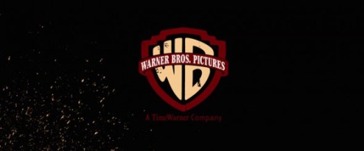
Love the striking colours of this one against the dark background. The Losers wasn’t a great film (but it wasn’t totally terrible) but it did embrace it’s comic book origins and this logo does a great job with that.
Ocean’s 13 (2007)

The contrast of the black and white logo on the red background make this one for me. The black and red titling in marketing for the _Ocean’s_ films was cool and this was a nice compliment to that.
Rocknrolla (2008)

I don’t know why exactly I like this one, it’s probably the busiest version that I do like, but I do like it.
Enter the Dragon (1973):

The classic Saul Bass design from the 70s. Simple and elegant and perfectly designed for it’s time. Then again, Saul Bass designed basically everything in the 1970s so that makes a certain amount of sense.
You can see my own tastes tend toward the simpler variations but with over 200 to choose from there’s certainly something for everyone in there. Which one is your favourite??
You must be logged in to post a comment.